Leone
Visual Identity & Website
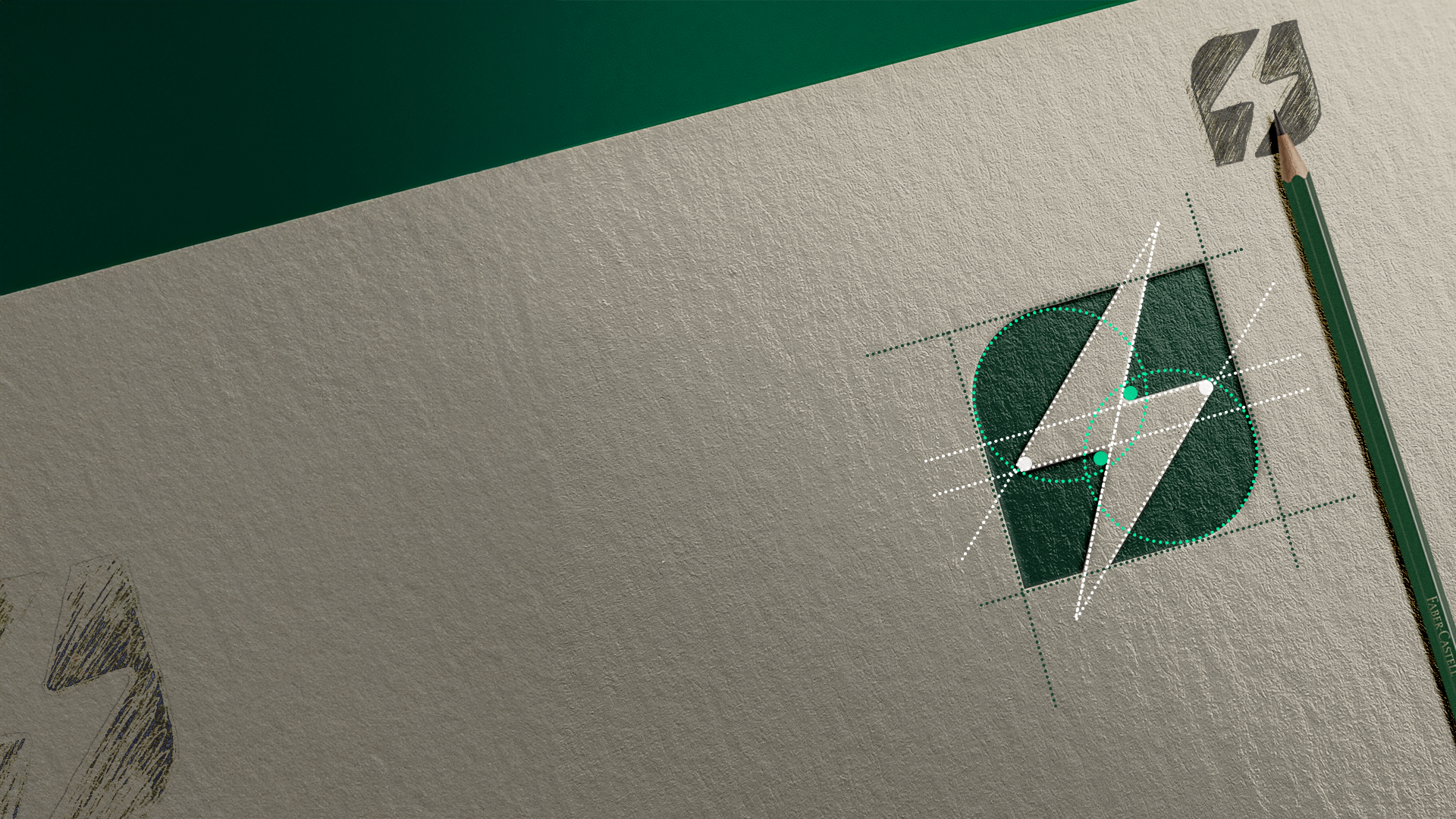
Inspiration
The rebranding of Leone Cidadania was designed to express confidence, empathy, and legacy.
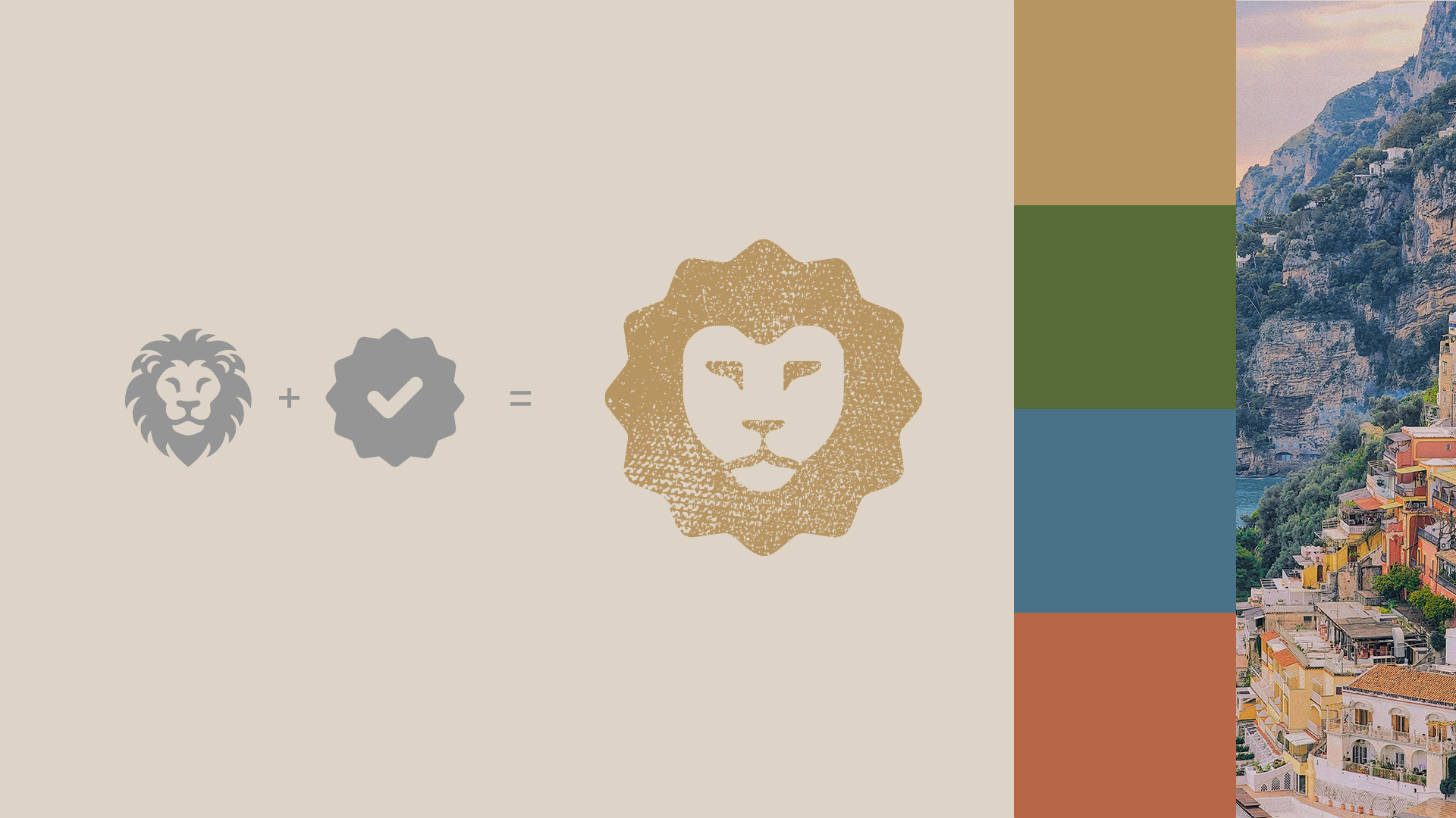
The lion, inspired by the founders’ family heritage, symbolizes courage, tradition, and the pursuit of new beginnings, much like a passport stamp marking life’s milestones.
The goal was to build an identity that feels powerful yet deeply human.
Result
The color palette combines warmth and strength in perfect balance. Terracotta red embodies determination, olive green represents prosperity, deep blue conveys trust, and soft yellow adds optimism.
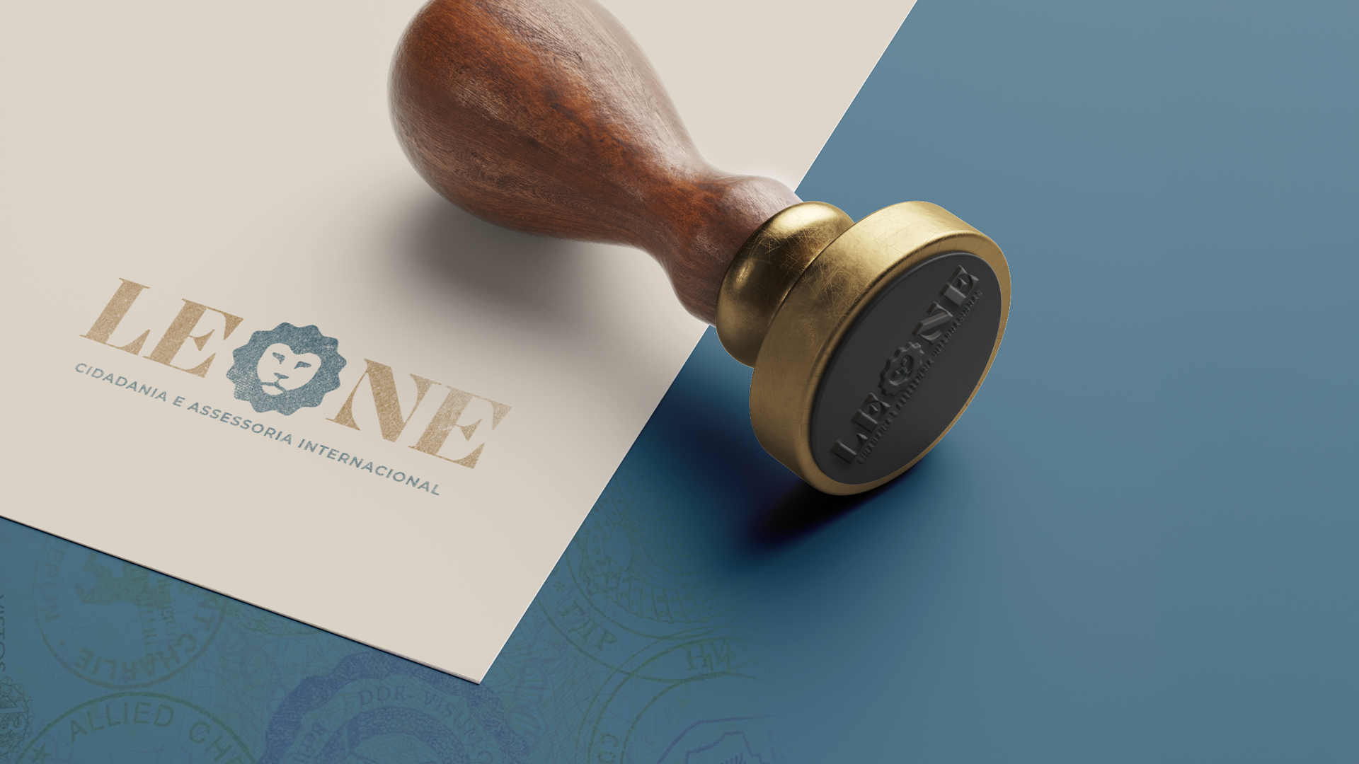
The result is a brand that bridges European heritage with modern global sophistication, mature and confident while remaining inviting.
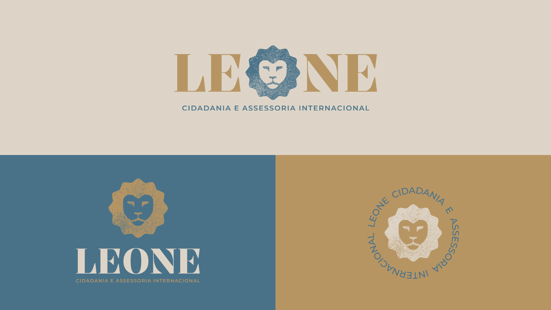
Logos
The typography was inspired by the engravings of classical European monuments and customized to capture elegance and authenticity.
The alternate and submark versions ensure consistency across every touchpoint, from social media and digital platforms to printed documents and brand materials.
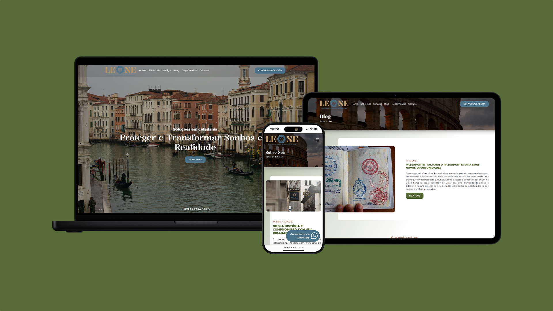
Website
Developed the visual identity and a bilingual institutional website for Leone Cidadania, tailored to the European and international market.
The platform highlights services with integrated client reviews, credibility features, and a scalable structure optimized for SEO and paid traffic.
Built to be functional, agile, and user-friendly, it positions the brand as a trusted digital hub with global reach.