Di Prima
Visual Identity & Website
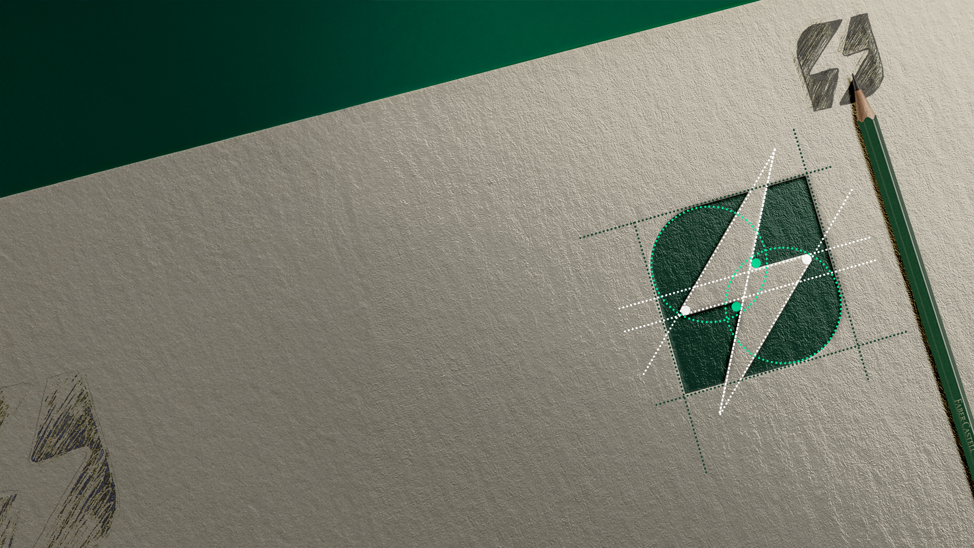
Inspiration
The new identity for Di Prima Catering reflects a brand entering a new chapter while keeping its excellence intact under
Chef Marcus Roberto.
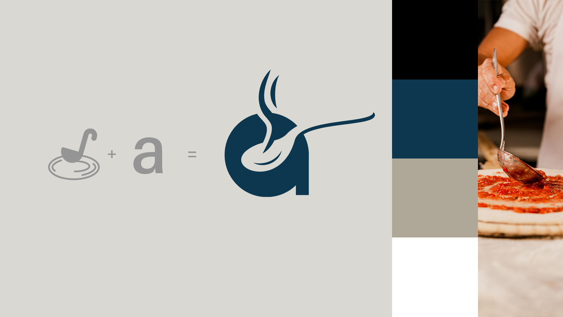
We focused on elegance and simplicity, translating the essence of preparation and service into the logo itself. The letter A subtly evokes a pizza being assembled, modern and symbolic of the brand’s craft and authenticity.
Result
The final identity is refined and versatile. The black and white palette expresses confidence and sophistication, while soft beige and blue tones bring warmth and character.
Together they create a brand that feels balanced, elegant, and unmistakably genuine.
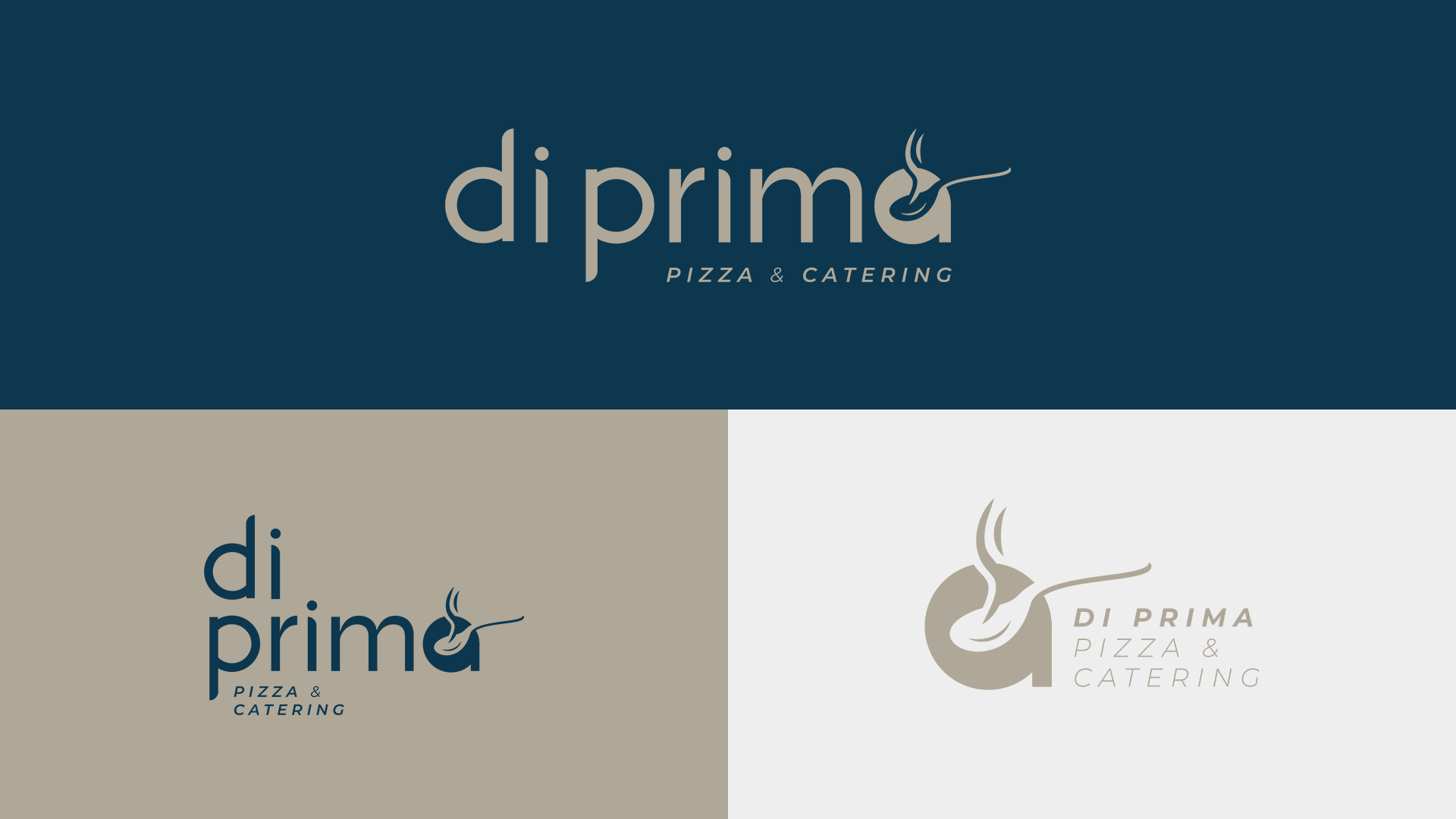
Logos
The typography was custom-designed to express simplicity and grace. Using lowercase letters makes the brand approachable while preserving its premium feel.
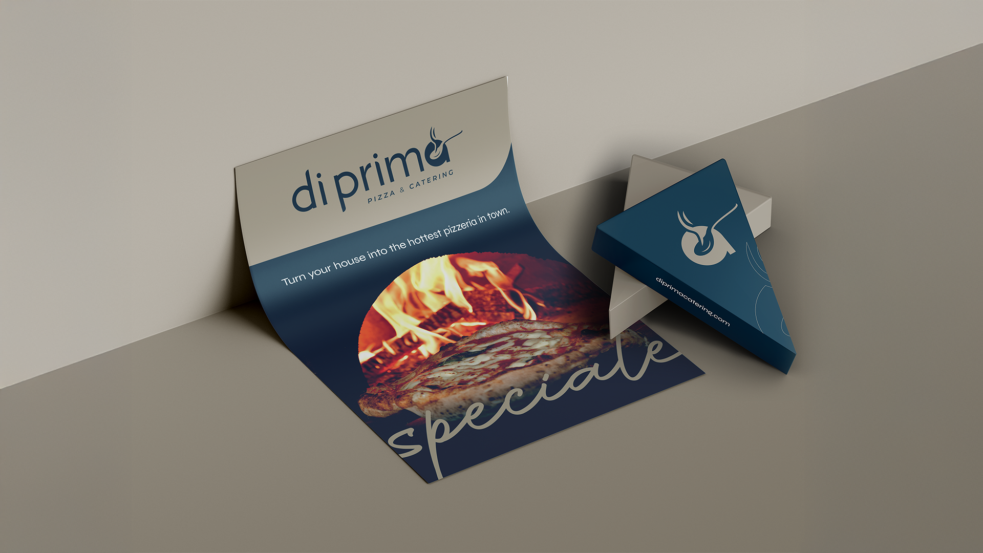
The three logo versions - main, alternate, and submark - allow for seamless application across menus, websites, packaging, and event materials.
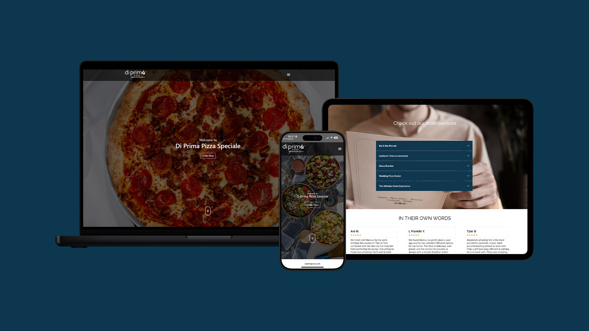
Website
Developed a robust e-commerce website for Di Prima, tailored to the gastronomic sector with full online ordering capabilities.
The platform combines accessibility, intuitive navigation, and seamless integrations to support customer experience and operational efficiency.
Optimized for SEO and paid traffic, it positions the brand as a modern, scalable digital presence in the food and restaurant market